Classy-UIを触った
JavaScript, CSSClassy-UI について
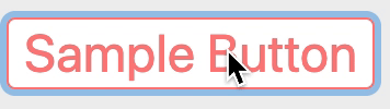
サンプル
Classy-UIとは
CSSプロパティを抽象化するJavaScript/TypeScriptライブラリ。
ざっくり言うと「プロパティで組み立てるCSSフレームワーク」。
比較対象に挙げられるのが、Tailwind CSS。
Tailwind CSS がクラス名を組み合わせるのに対して、Classy-UI はプロパティの定数を組み合わせる。
ライブラリ特有の知識でなく、CSS プロパティの知識で構築できるのが良いところ。
IDE の補完も受けられるので、「SMALLって言われても、どんぐらいSMALLよ」な問題もない。
欠点は、クラス名ベースでのデザイン構築に比べて、CSS の知識に依存しがちなこと。
プロパティの記述も人によってまちまちで、styleLint なども使えない。そこはご愛嬌…。
あと、スタイルがまとめて出力されるようなので、Above the Fold 向けの CSS を書きづらい。
使い方
Classy-UI の実態は、プロパティをクラス名に変換する Babel プラグイン。
また、型の恩恵を受けられるのが望ましいので、実質 Babel + TypeScript 環境が必須。
この記事の公開日時点では、classy-ui@beta がインストール可能。
shell
npm install -D classy-ui@beta
さらに、babelrc でプラグインの設定が必要。
babelrc
{
  "plugins": [["classy-ui/plugin"]]
}
compose関数内でtokenを使って、プロパティを流し込む。
classy-ui-sample.ts
import { compose, tokens } from 'classy-ui'

const composedElement = compose(
  tokens.borderWidth.WIDTH_1,
  tokens.borderColor.GREEN_700,
  tokens.color.GREEN_700,
  tokens.borderRadius.SMALL,
)
作成したスタイルは、出力時にはクラス名として変換される。
以下は dev でのもの。
classy-ui-sample.ts
// border-top-width__WIDTH_1 border-right-width__WIDTH_1 border-bottom-width__WIDTH_1 border-left-width__WIDTH_1 border-top-color__GREEN_700 border-right-color__GREEN_700 border-bottom-color__GREEN_700 border-left-color__GREEN_700 color__GREEN_700 border-top-left-radius__SMALL border-top-right-radius__SMALL border-bottom-right-radius__SMALL border-bottom-left-radius__SMALL
prod では classy-ui.css が、build フォルダのルートに出力される。
それを HTML 側で読み込んで使用する。
build/classy-ui.css
.A__A{border-top-color:#fc8181}.B__A{border-right-color:#fc8181}.C__A{border-bottom-color:#fc8181}.D__A{border-left-color:#fc8181}.E__B{border-top-width:1px}.F__B{border-right-width:1px}.G__B{border-bottom-width:1px}.H__B{border-left-width:1px}.I__C{border-top-left-radius:.25rem}.J__C{border-top-right-radius:.25rem}.K__C{border-bottom-right-radius:.25rem}.L__C{border-bottom-left-radius:.25rem}.M__D{color:#fff}.M__A{color:#fc8181}.N__A{background-color:#fc8181}.N__D{background-color:#fff}
その特性からSPAフレームワーク/ライブラリ向けで、ドキュメントにはCRAやNext.jsでの導入手順がある。
今回は間をとってReact + webpack と Nuxt.jsで試した。
やる
React
(webpack4.42, @babel/core7.8.7, React 16.13, TypeScript 3.8.3 時点)
Babelプラグインを、".babelrc"のpluginsに設定しておく。
また、outputオプションを"dist"に変える。初期値が "build" フォルダのため。
babelrc
{
  "presets": ["@babel/preset-typescript", "@babel/preset-react"],
  "plugins": [["classy-ui/plugin", { "output": "dist" }]]
}
{ isActive: boolean } を受け取る、ボタン向けのてきとうな style を作成してみる。
ネストを許さないような作りになっていて、擬似クラスを値の後に設定できたり、子要素まで擬似クラスを適用させるようなAPIがある。詳細は公式ドキュメントで。
src/components/styles.ts
import { compose, tokens, mobile } from 'classy-ui'

export const styleButton = (props: { isActive: boolean }) =>
  compose(
    tokens.borderColor.RED_400,
    tokens.borderWidth.WIDTH_1,
    tokens.borderRadius.MEDIUM,
    tokens.fontSize.EXTRA_LARGE_2,
    tokens.outline.NONE.focus,
    tokens.boxShadow.OUTLINE.focus, // 値の後に擬似クラスを指定できる
    props.isActive ? tokens.color.WHITE : tokens.color.RED_400,
    props.isActive
      ? tokens.backgroundColor.RED_400
      : tokens.backgroundColor.WHITE,
    mobile(tokens.fontSize.EXTRA_LARGE_4), // media query
  )
作った styleButton を、コンポーネントの className に噛ませるだけ。
src/components/SampleButton.tsx
import React, { useState } from 'react'
import { styleButton } from './styles'

export const SampleButton = () => {
  const [isActive, setIsActive] = useState(false)
  const handleClick = () => {
    setIsActive(!isActive)
  }
  return (
    <button
      className={styleButton({ isActive })} // ここ
      aria-pressed={isActive}
      onClick={handleClick}
    >
      Sample Button
    </button>
  )
}
これで OK。
あとは、ビルド先で CSS ファイルを読み込む必要があるので、html-webpack-plugin を使って出力先の index ファイルに Link を追加する。
shell
npm install -D html-webpack-plugin
webpack.config.jsのplugins
plugins: [
  new HtmlWebpackPlugin({
    template: path.resolve(__dirname, 'src/index.html'),
    isProduction: process.env.NODE_ENV === 'production',
  }),
],
src/index.html
<!DOCTYPE html>
<html lang="en">
  <head>
    <meta charset="UTF-8" />
    <meta name="viewport" content="width=device-width, initial-scale=1.0" />
    <title>Classy-UI-Sample</title>
    <% if (htmlWebpackPlugin.options.isProduction){ %>
    <link rel="stylesheet" href="classy-ui.css" />
    <% } %>
  </head>
  <body>
    <div id="app"></div>
  </body>
</html>
Nuxt.js
(nuxt 2.0, @nuxt/typescript-build 0.6 で確認)
まず SFC から。
React の項で作成した styleButton をそのまま使っている。
components/ButtonComponent.vue
<template>
  <button
    :class="style"
    :aria-pressed="isActive ? 'true' : 'false'"
    @click="toggleActive"
  >
    Sample Button
  </button>
</template>

<script lang="ts">
import Vue from 'vue'
import { ref, computed } from '@vue/composition-api'
import { styleButton } from './styles' // classy-ui

export default Vue.extend({
  setup() {
    const isActive = ref(false)
    const style = computed(() => styleButton({ isActive: isActive.value })) // style
    function toggleActive() {
      isActive.value = !isActive.value
    }
    return {
      isActive,
      style,
      toggleActive
    }
  }
})
</script>
"nuxt.config.js"の build に babel オプションを追加。
output を '.nuxt/dist/client' に。
nuxt.config.jsのbuild
build: {
  // ...others
  babel: {
    plugins: [['classy-ui/plugin', { output: '.nuxt/dist/client' }]]
  }
}
さらに head の link を下記のようにする。
nuxt.config.jsのhead
head: {
  // ...others
  link: [
    process.env.NODE_ENV === 'production' && {
        rel: 'stylesheet',
        href: '/_nuxt/classy-ui.css'
      }
  ]
}
これで npm run build すると classy-ui.css が出力される。
generate の場合は、出力先、link を"/dist"に当てるだけ。
感想など
- CSS のプロパティに寄り添う音楽性が好き
- 独自の定数を追加することも可能